CSS Sprite Sheet Animation: A Step-by-Step Guide with steps()
When building interactive websites, landing pages, or browser-based mini-games, adding micro-animations brings your user interface to life. While animated GIFs and videos work for simple media embeds, they do not give you programmatic control over playback, hover states, or responsive scaling.
This is where CSS sprite sheet animation shines. By combining a single PNG sprite sheet with CSS @keyframes and the steps() timing function, you can create silky-smooth, lightweight animations that load instantly and cost almost nothing in browser CPU overhead.
In this tutorial, we will walk through how CSS sprite animations work under the hood, how to write the code from scratch, and how to make your animations crisp on high-DPI displays.
How CSS Sprite Animation Works
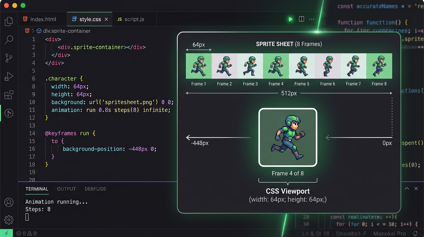
Normal CSS transitions animate properties smoothly over time. For example, moving an element from left: 0px to left: 100px calculates all the intermediate fractional positions in between.
If you apply a standard transition to a sprite sheet, the browser will smoothly slide the background image across the viewport. Instead of an animation, you will see a frantic, blurred film strip rushing past!
To fix this, CSS provides the steps() timing function. Instead of interpolating smoothly, steps(N) tells the browser: “Jump instantly between N discrete positions across the duration of the animation.”
- Continuous (linear transition): Slides smoothly between 0% and 100%, causing a fast blur.
- Steps (
steps(4)): Jumps instantly across discrete positions (Frame 1 → Frame 2 → Frame 3 → Frame 4), producing a clean frame-by-frame animation.
Step 1: Prepare Your Sprite Sheet Horizontal Strip
For CSS animations, organizing your frames in a single horizontal strip is easiest to calculate.
Suppose you have an 8-frame character idle animation where each frame is 64px wide and 64px tall.
- Single Frame Width:
64px - Total Strip Width: $8 \times 64\text{px} = 512\text{px}$
- Height:
64px
(If your animation is currently an $N \times M$ matrix grid, you can use our free spritesheet to gif converter or unpack it with the gif to spritesheet splitter to re-align your frames into a clean strip).
Step 2: Write the HTML Markup
Create a simple container element for the sprite:
<div class="sprite-character"></div>Step 3: Write the CSS Animation Rules
Here is the complete CSS code required to bring your sprite to life:
.sprite-character {
  /* Set the container to the dimensions of a SINGLE frame */
  width: 64px;
  height: 64px;

  /* Load the horizontal sprite sheet */
  background-image: url('/assets/sprites/character-idle-strip.png');
  background-repeat: no-repeat;
  background-position: 0 0;

  /* Trigger the steps animation */
  animation: play-sprite 0.8s steps(8) infinite;

  /* Preserve sharp pixels on high-DPI screens */
  image-rendering: pixelated;
}

@keyframes play-sprite {
  from {
    background-position: 0 0;
  }
  to {
    /* Shift the background by the FULL width of the entire strip */
    background-position: -512px 0;
  }
}
Breaking Down the Key Properties:
width: 64px; height: 64px;: Sets the viewport window to show exactly one frame at a time.animation: play-sprite 0.8s steps(8) infinite;: Plays the animation over 0.8 seconds, dividing the movement into exactly 8 equal frame jumps, and repeats forever.background-position: -512px 0;: Shifts the background from left (0px) to the full negative width (-512px).image-rendering: pixelated;: Ensures crisp, sharp edges without muddy browser anti-aliasing.
Interactive Controls: Hover States and Triggering via JS
Because this is pure CSS, you can easily control playback states using standard CSS classes or hover selectors:
/* Pause animation by default, play on hover */
.sprite-character {
  animation: play-sprite 0.8s steps(8) infinite;
  animation-play-state: paused;
}

.sprite-character:hover {
  animation-play-state: running;
}
You can also dynamically swap animations (e.g., from idle to walk) simply by changing the background-image and adjusting the steps() count via JavaScript.
Advantages Over Animated GIFs in Web Apps
| Feature | CSS Sprite Sheet | Animated GIF |
|---|---|---|
| File Size | Extremely compact (1 PNG) | Larger due to frame headers |
| Color Support | Full 24-bit RGB + 8-bit Alpha | Limited to 256 indexed colors |
| Transparency | Smooth semi-transparent alpha | Binary 1-bit transparency |
| Playback Control | Play, pause, reverse via CSS/JS | Plays automatically, cannot pause |
| Sharper Scaling | Native CSS image-rendering | Can get blurry when scaled |
Summary
CSS sprite sheet animations offer an incredible balance of visual polish, tiny file footprints, and total programmatic control. Whenever you need interactive icons, lively character badges, or retro game UI in your web applications, pure CSS with steps() is the gold standard approach.